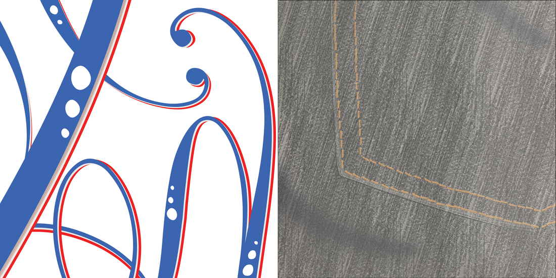
The first two projects of the 2013-2014 school year were based on making images out of type. In both the "type as an image" and "type as a texture" projects, I discovered that you can make anything out of text. Even so, based on how each of the projects turned out, I can say that they look nothing alike. The only similarity one could make just by looking at them is that both are made from text. During the creation of both projects I was growing irritated due to the amount of time it took to make the finished product. In the "type as a texture" project, I even changed the image from a potato chip texture to the denim texture you see above. So because of these projects I found out that to make a strong design, you must take your time. Without making these projects and writing about them now, I probably would have never found out that time will help you in your designs. Both of the text projects have different qualities to them. The "text as an image" project allowed us to explore more ideas. While the "text as a texture" project had us pined down to a certain texture. Even though we could take the picture (which I did) and use that, there was little possibility of making them look like they were from the same artist. Maybe if instead of starting with the "text as an image" project, we switched it and started with the other one. That way we could base our more open project on how we made the "text as a texture" project. However, if we did do that, the "text as an image" would then be less open minded. So after thinking about it for awhile, I feel that the order in which we did the projects originally were better suited for us growing as designers.
